
Gruha Healthcare
Web Design
Commercial Project
UI Design
1 month
The shots used in this case study may differ from the live website due to updates and/or complications during development.
Context
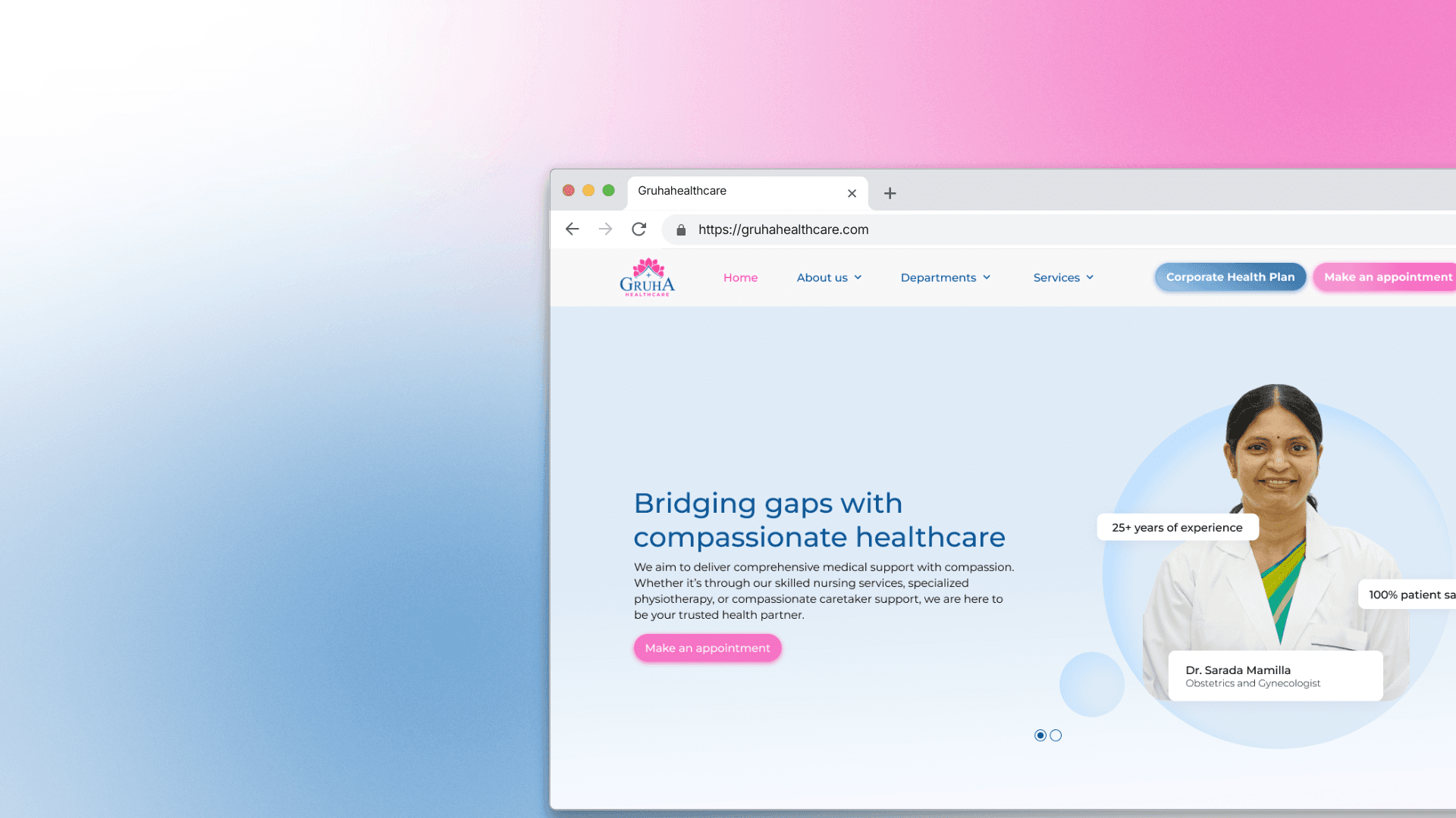
The previous website was hastily put together by modifying a WordPress template and did not embody Gruha Healthcare’s values.
After using the initial version of the website for the first few months of their healthcare enterprises lifetime, the client wanted to upgrade with a website that had more functionalities and an updated aesthetics. Their current website was a 5 page template with bare minimum functionalities while Gruha wanted a website that would allow users to book appointments and diagnostics tests from the comfort of their home.
Gruha’s journey began when the founders experienced lack of compassion in the healthcare industry. In India there has been a rising requirement for quality home care – care takers, nursing care, and physiotherapy. People shifting away from their homes in search of better employment opportunities, older members of the household are alone, with no one to take care of them in case they needed medical attention.
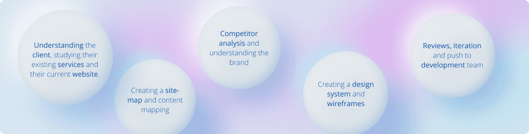
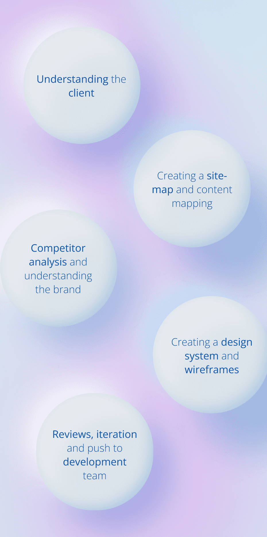
Process
The Design process behind this website
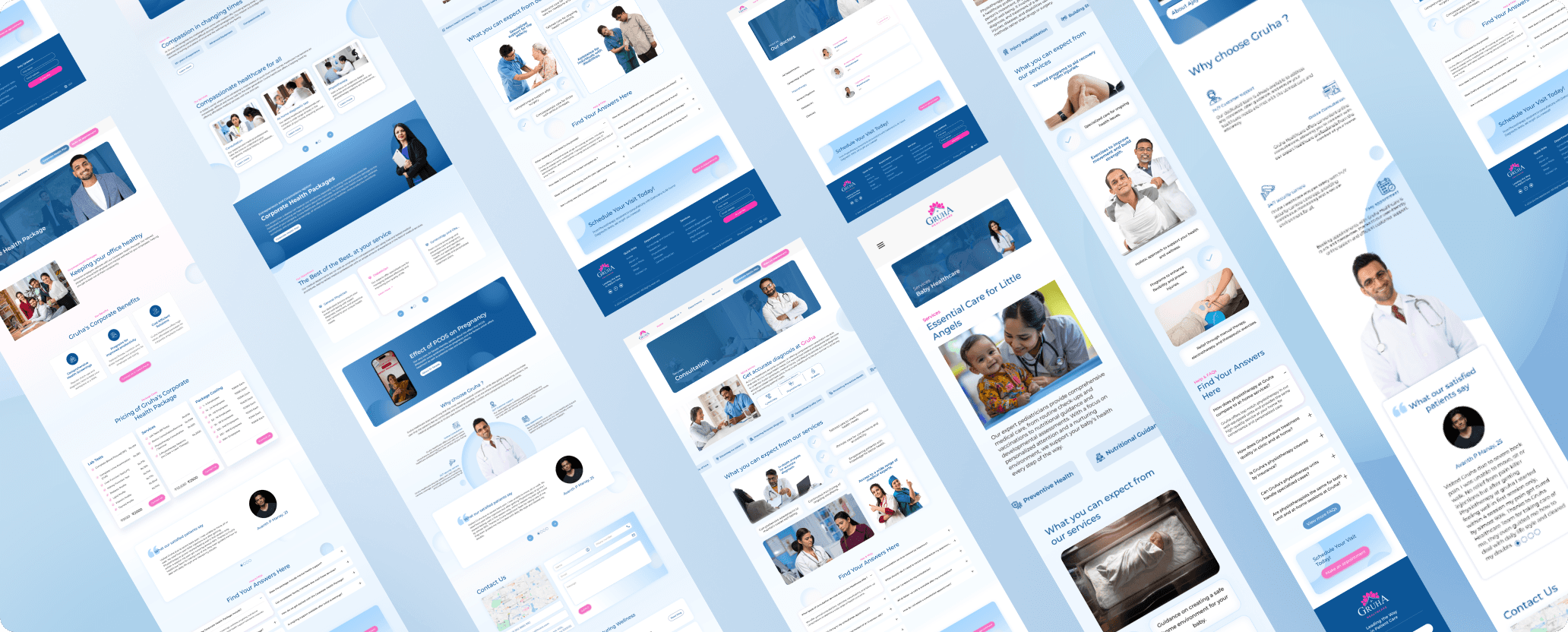
Solution
Shots and iterations of the design
Research
Competitor Analysis
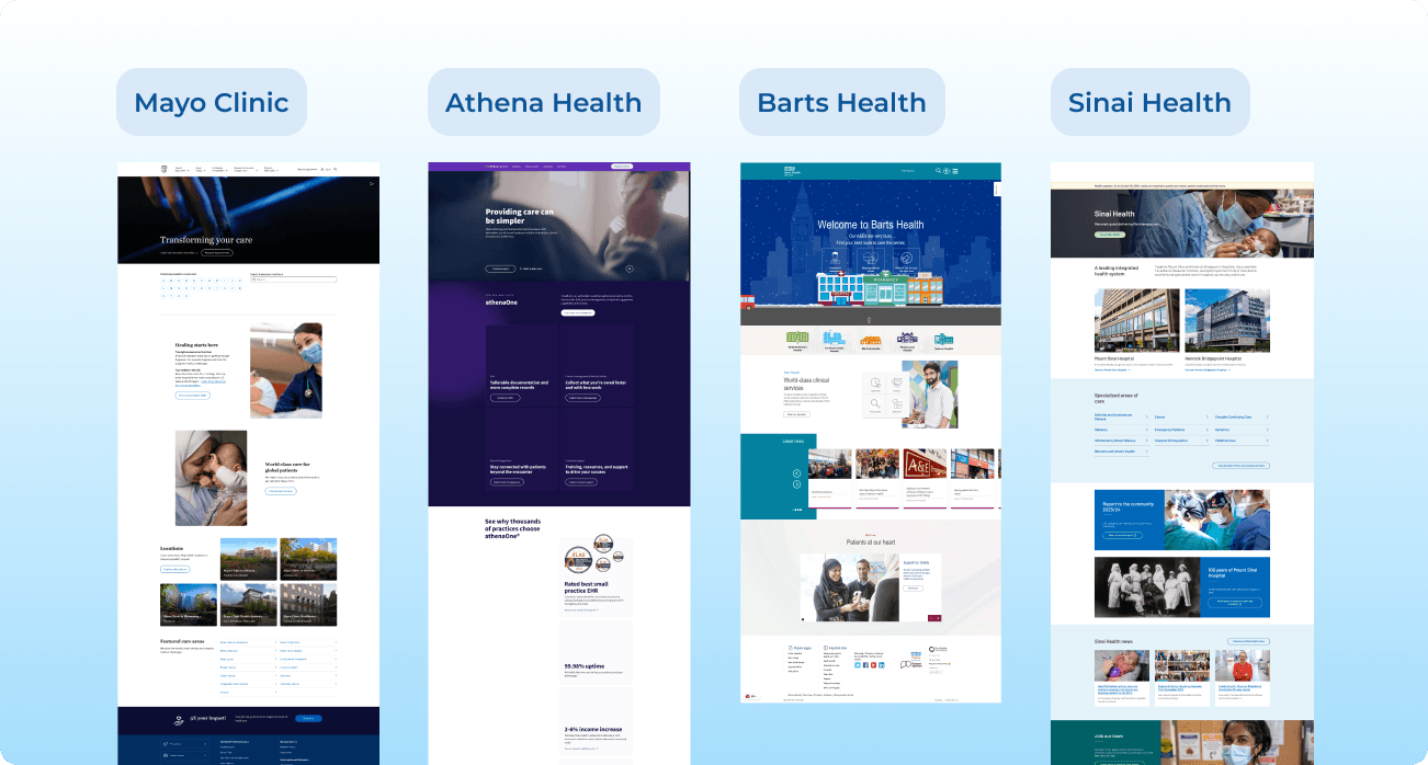
After receiving the brief, my first order of business was to find out the general styles and flows of similar websites. This helped me immensely when the time to meet the client had come. It also helped me understand do’s and don’ts of designing medical websites.
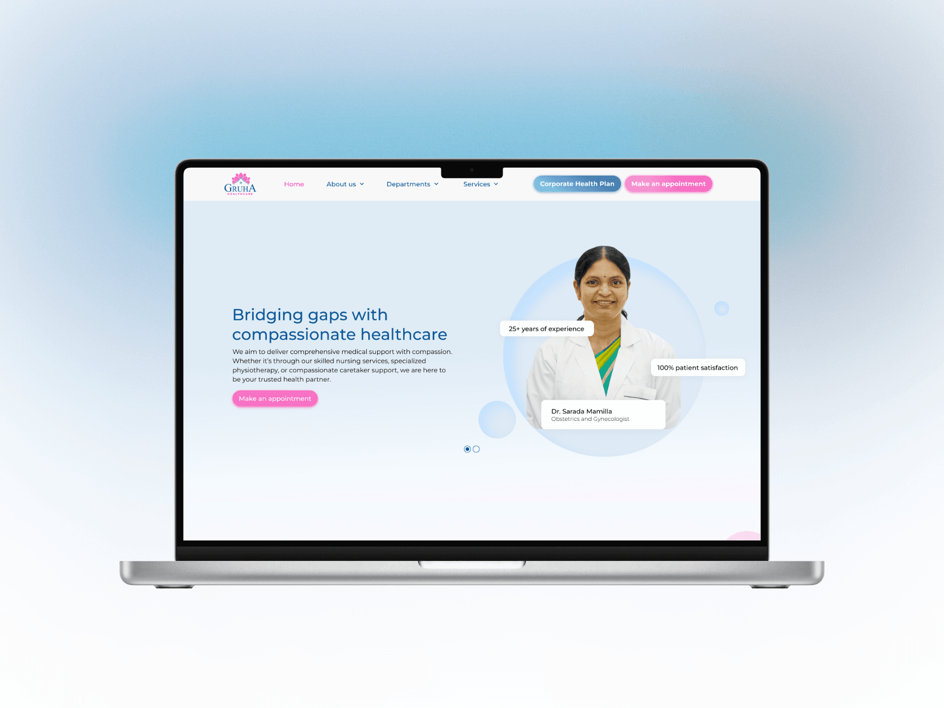
Home Page
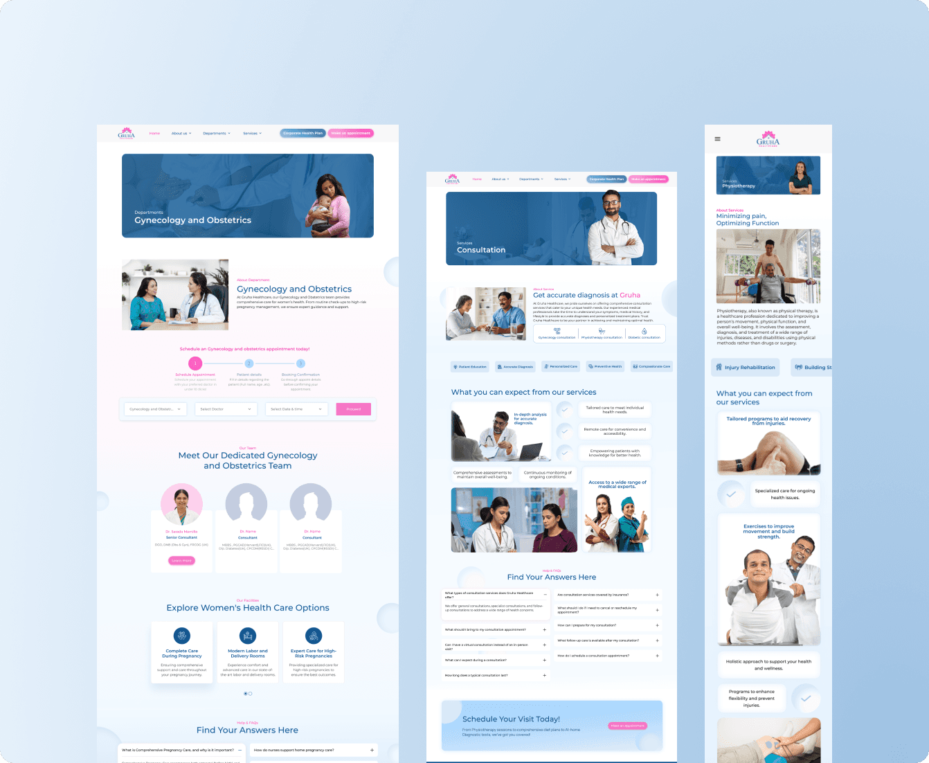
Departments/Services
Doctors
Contact
Book Appointments
About
Media content
Research
What Gruha Healthcare wanted out of a new website
In my first meeting with the client, I was told the story of how Gruha healthcare came to be. I was also informed about the services they offer, the services they wanted to push more, and any specific features/functionalities that they had in mind for the website.
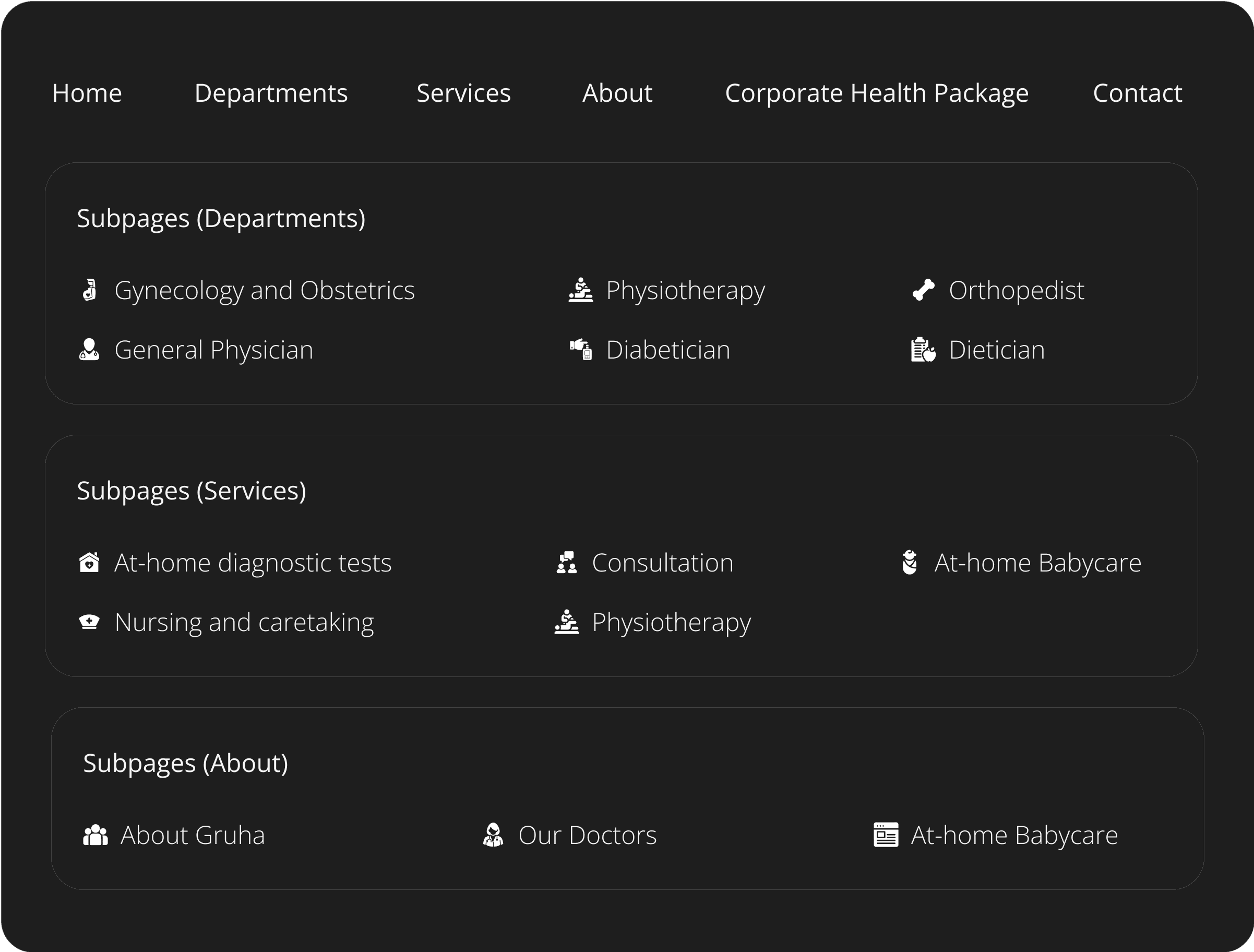
The client wanted a modern website that gave a feeling of warmth and care. They wanted to market their at-home diagnostic tests and their corporate health packages. Post-meeting, I was able to nail down a preliminary site-map.
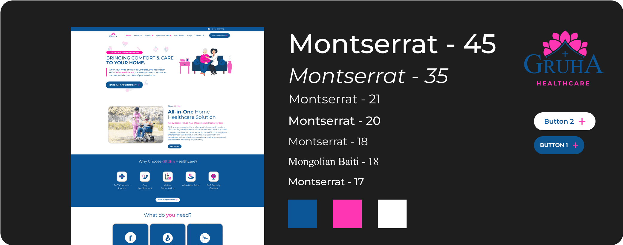
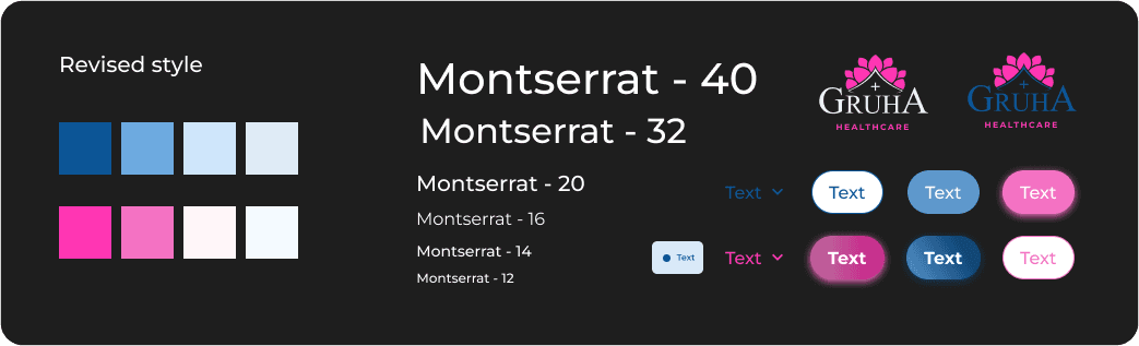
Brand Guidelines
Nailing down the styles
Post research, I studied the previous website and the other brand guidelines followed for Gruha Healthcare related collateral. I also looked for any medical websites that follow a similar style, creating a miniature style guide to follow.
Different aspects of the original website.
Design
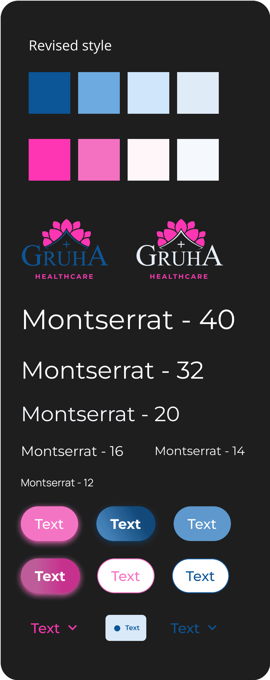
Wireframing
The first step was to figure out the content that would go on the website. Competitive research already made me familiar in the usually content structure of a hospital/clinic’s website. I had to tweak that content and then rearrange the sections in order to get a good flow. I also built a set of components for the nav bar, footer and other repeating content in order to make it easy for future edits.
After assembling these components, I proceeded to design the high - fidelity wireframes of the pages in desktop, tablet and mobile version. After numerous reviews and revisions, the website was pushed to the development team.
Cut content
The part that didn’t make it
One of the functionalities that the client wanted in the website was a search option for lab tests. I designed a section for the At-home diagnostics page which would allow patients confined to their home to be able to search for the prescribed diagnostics test. This part didn't make the cut as the development team used a plug in instead in order to accomplish this aspect,
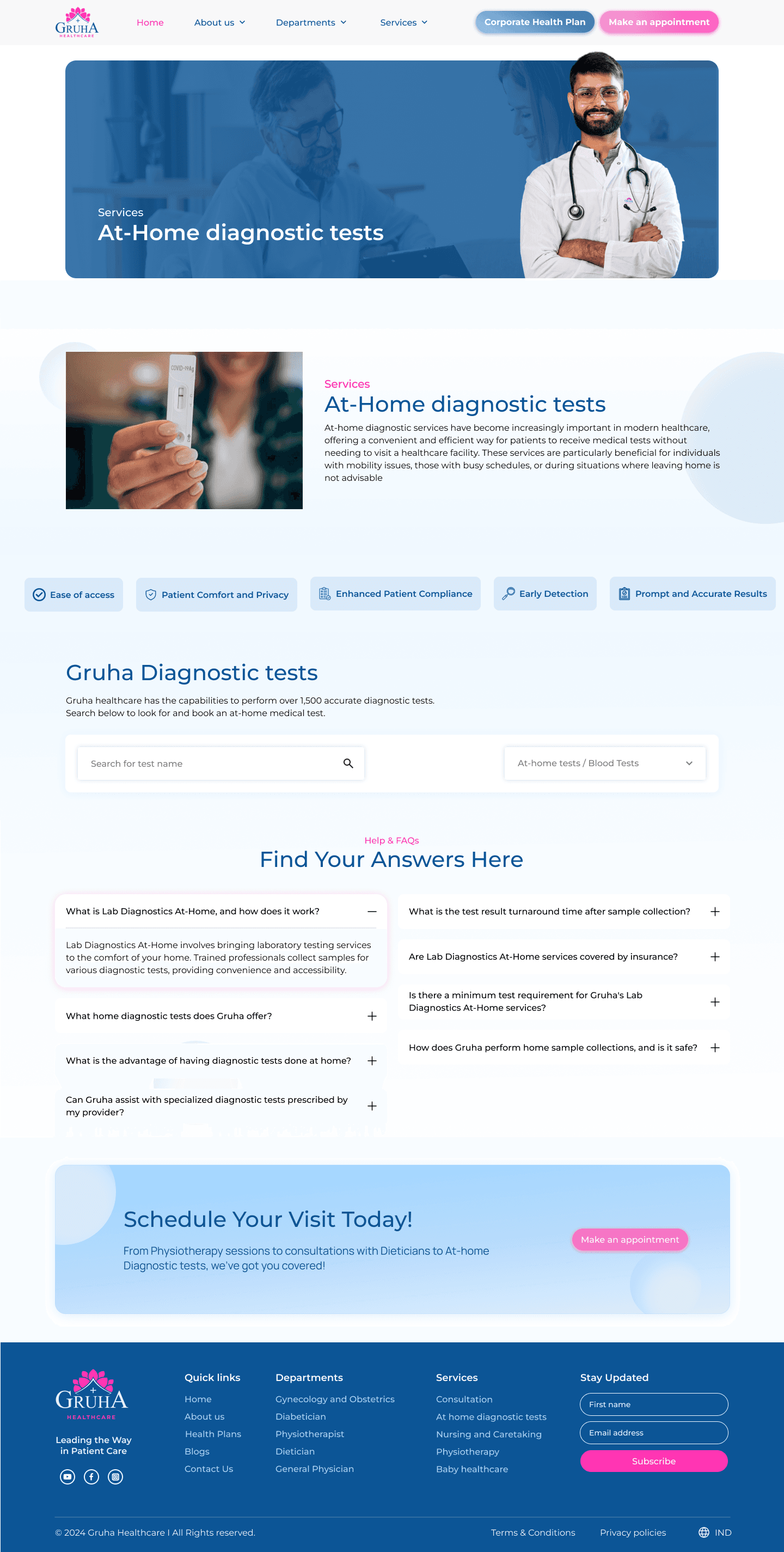
The search bar in the At-Home Diagnostics page
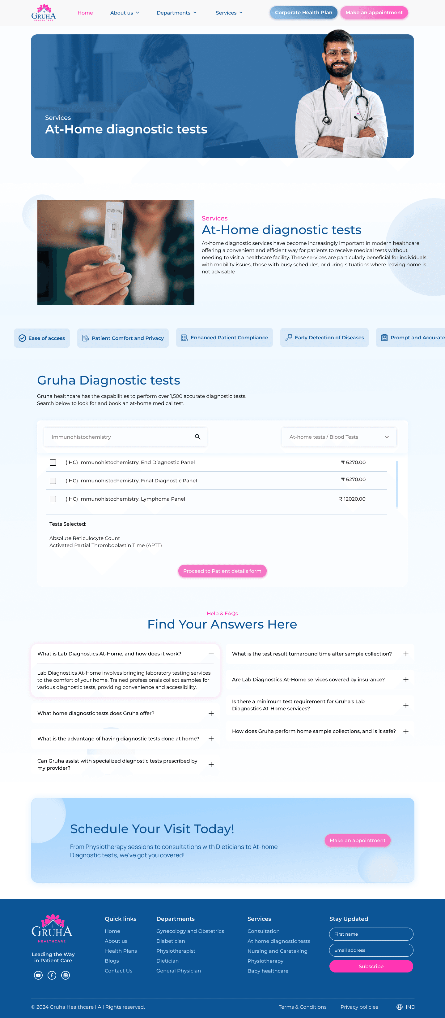
Suggestions based on letters entered
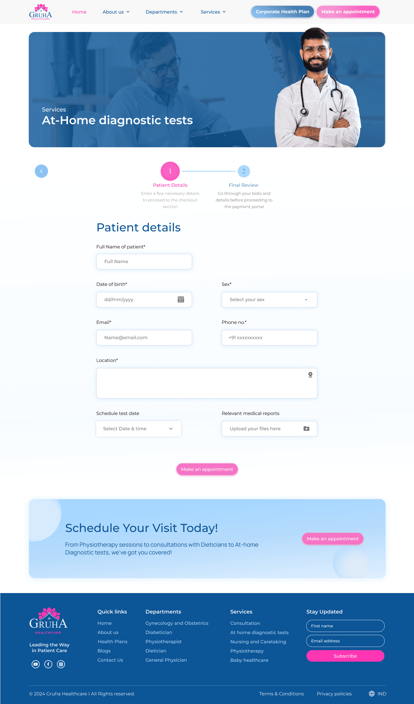
Details form before proceeding to..
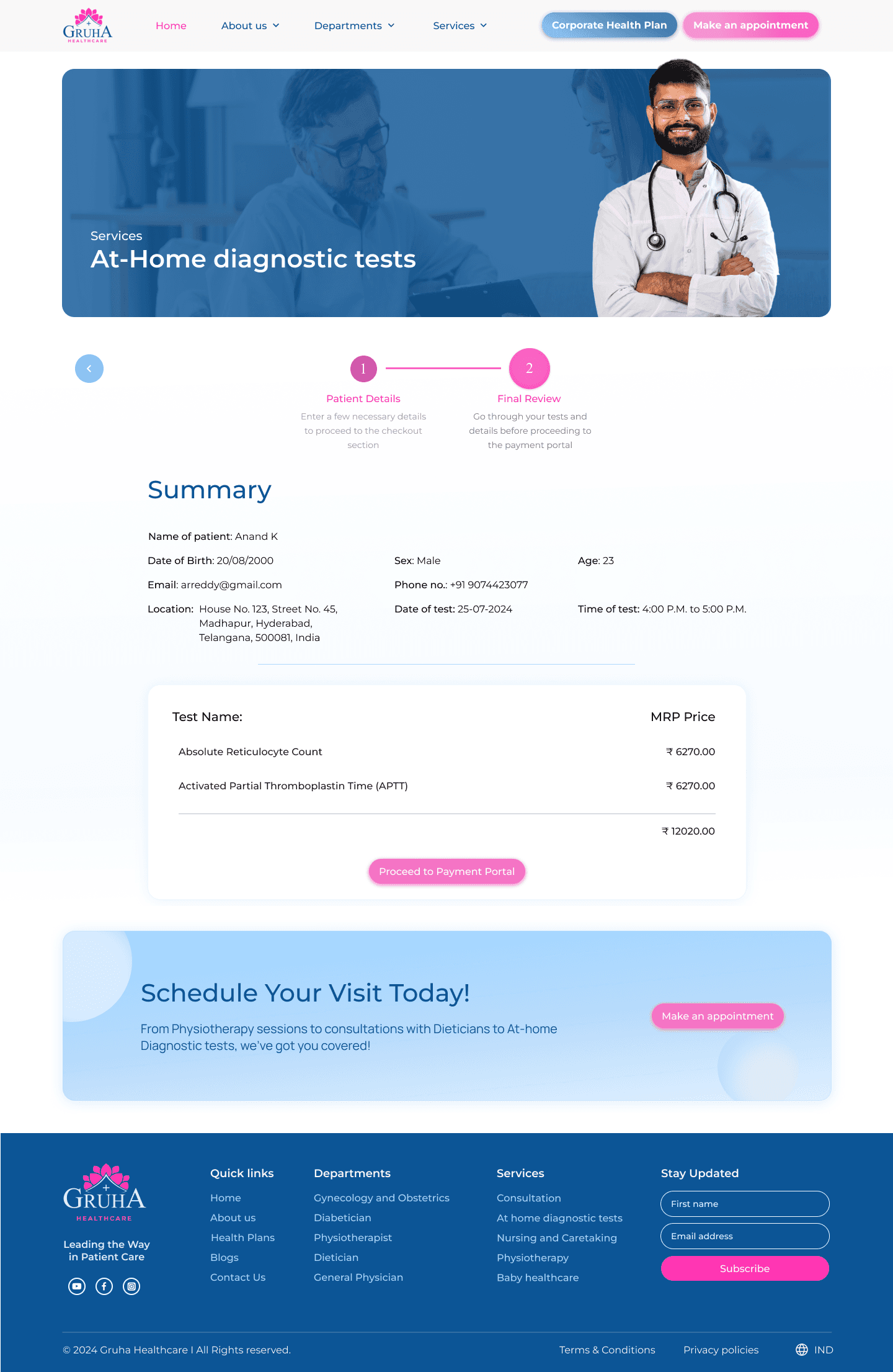
Summary of form